
users challenges
One of the primary obstacles that both students and professionals encounter when trying to pursue further education is managing their time and developing a study routine.
Source of knowledge for learning
Many research participants turn to YouTube for educational content. Additionally, official documentation of technologies is another valuable source of relevant knowledge for these participants.
Favourite formats
The four preferred formats to study are videos, articles, books and blogs.
How do they measure learning?
The most common methods of measuring learning include completing exercises, studying case scenarios, and undertaking small projects.
Usability Test
We conducted a usability test on the current product to identify necessary improvements for the redesign. Our goal was to investigate the underlying reasons for navigation problems and pinpoint any factors that may be leading to customer loss or attrition.
In the moderated and online test, we gave assignments to the participants and inquired about their thoughts on the current product.
After gathering feedback, we discovered some key points:
play_arrow The majority of users were under the impression that the site was for courses.
play_arrow It was unclear to users whether the content was free or not.
play_arrow Users were frustrated by the excessive number of external links.
play_arrow Some website sections were hard to comprehend, perhaps because they did not adhere to standard conventions.
We also found that users experienced the most difficulty with the following activities:
Marking topics as complete
didn’t complete
40%
Searching for exercises
users struggling
40%
20%
didn’t complete
Creating a new roadmap
users struggling
60%
20%
didn’t complete
We decided to emphasize on the pages and features that the users struggled with in the usability tests, so we could design new prototype pages according to their real needs.
Solution Alternatives
After analyzing the survey results, we considered potential solutions for redesigning the project while prioritizing User Experience heuristics. We categorized feedback into high, medium, and low priority levels, and used them as a starting point for exploring changes.
One of our main goals was to simplify the text, as we discovered that excessive wording caused many users to overlook important information. Instead, we now focus on providing relevant information such as roadmaps and free content.
We also proposed a new approach for roadmaps, to incorporate content directly into the site and avoid external links whenever possible
laptop
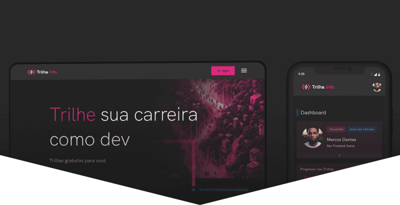
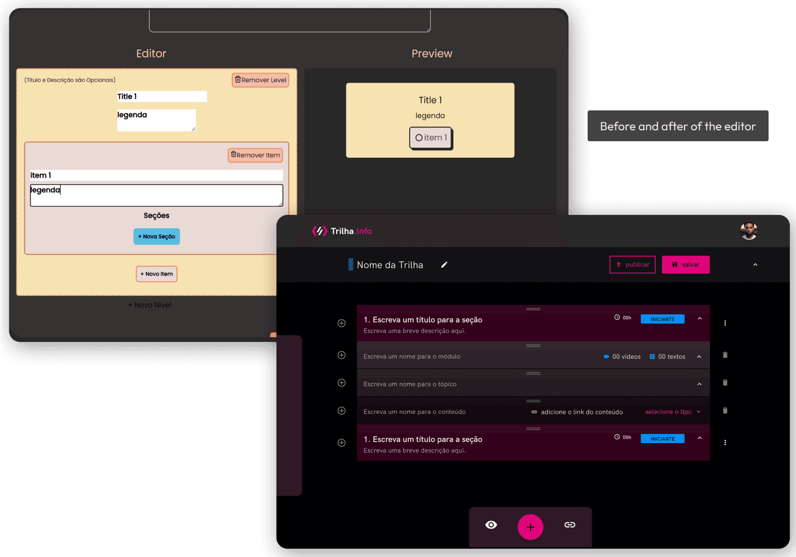
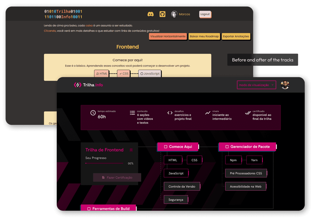
Prototype
I produced High Fidelity prototypes with the team that are stylized to match our Design System. We have reworked previous flows and reorganized the entire interface to make it more intuitive and practical.
Creating an easier and pleasant product certainly increases the perception of value.