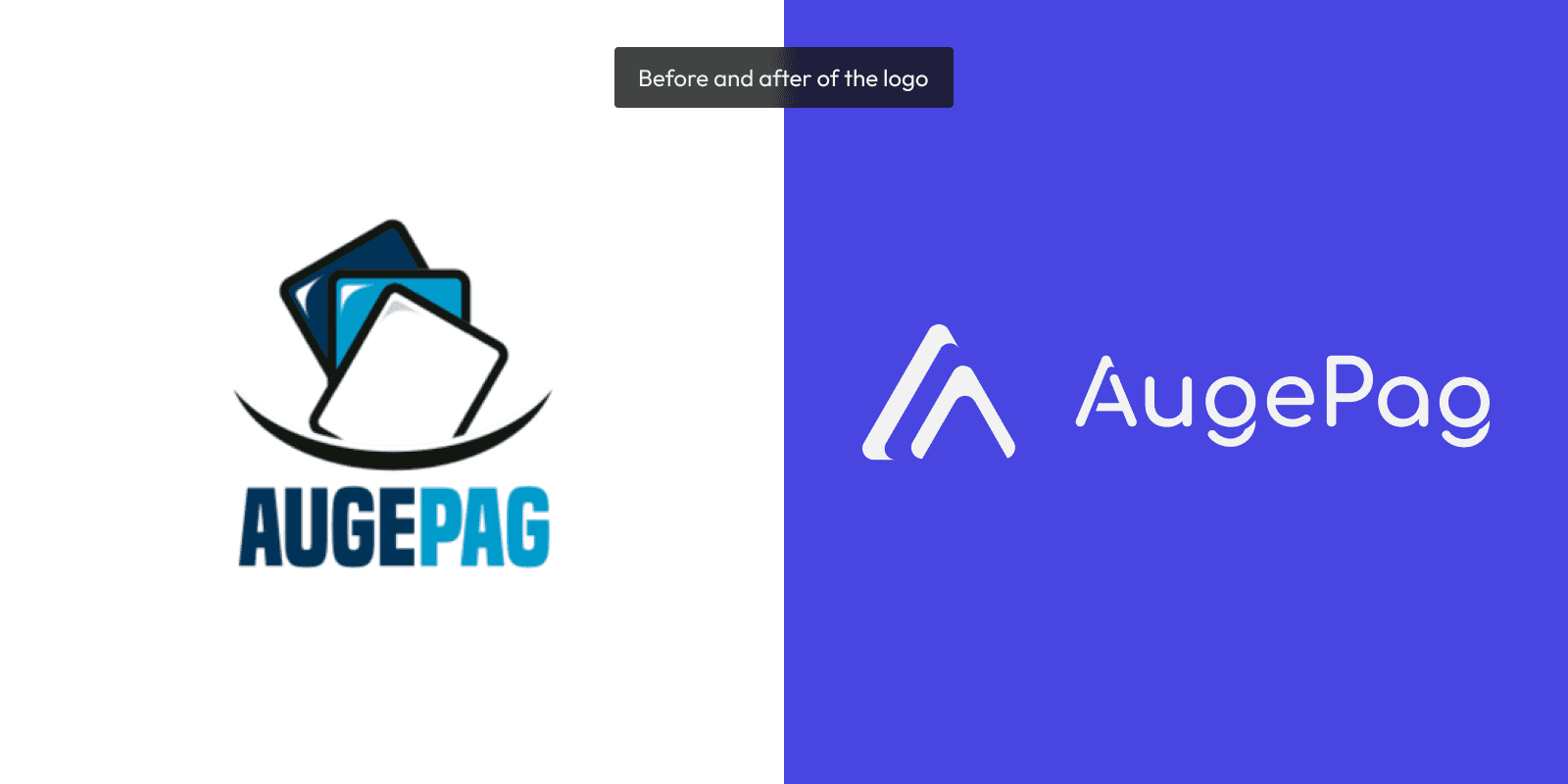
AugePag

AugePag

FinTech

FinTech

Bank

Bank

Information Architecture

Information Architecture

Type of Project: UI/UX

Items: Research, Visual Identity, Prototype - Responsive WebApp plus Backoffice website

Software Used: Figma

Team: Camilla Vieira and Fausen Cauã (UI/UX Design); Poliana Muniz (UI/UX - Landing Page)


person_pin
My role in the project

Manage the project and its processes, helping the team develop the best product. From the research to the final prototype, I coordinated and also built strategically and visually for the website. I also designed the visual identity.


center_focus_strong
The Challenge

Make AugePag's redesign, obtaining more simple and functional flows.


The current scenario

AugePag needed a system that allowed their clients to use the platform intuitively, allowing them to manage their businesses in an organized way. 

Our client wanted to appear more trustworthy to their clients.


A huge pain point of the system was the information architecture, due to the system's excess of information and function. Many functions and interface elements were added without a previous plan also, which made it appear loaded.


Users

AugePag's users are, in general, event producers and commercial establishments. They tend to use payment machines and need to manage their sales and payments on the Platform.


search
Qualitative Research

We conducted qualitative research, longing to understand user pain points for their current operation and how they manage their sales. The team tried to understand what was missing and what could be improved.


Information Architecture

We worked on rearranging the pages and items all over the system. The previous one had an excess of information that would cause cognitive load for the users, which could make the experience more tiring and also affecting the reliability of it. 


That was the main task of the project, being a huge challenge, and really important to bring an interface that makes sense for the client's operation. It allows AugePag to create a sense of trust and invite more clients to their platform. 


New Visual Identity

To improve the sense of reliability visually, a new logo was created, building a more modern and minimalist shape.
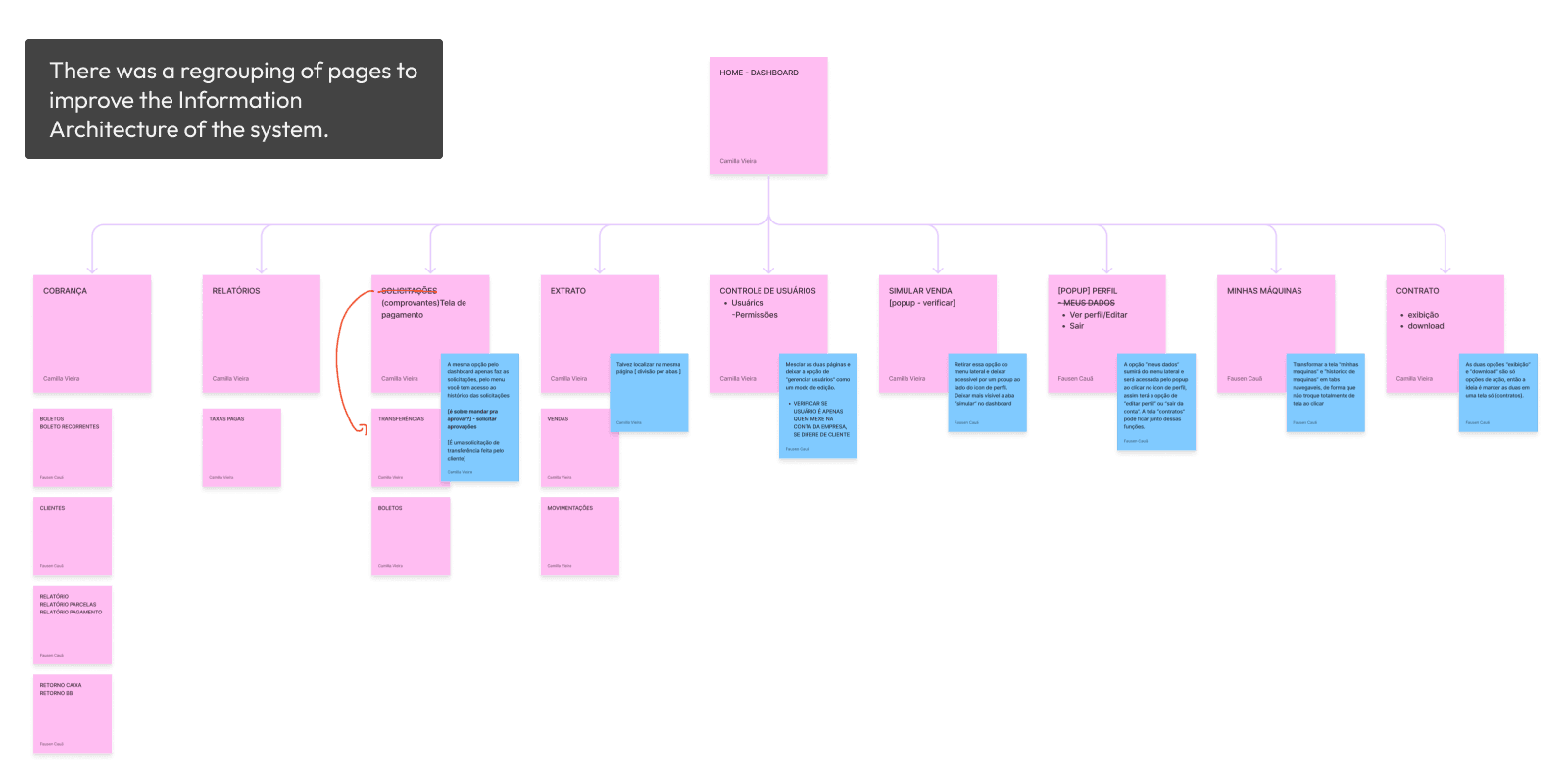


Interface Changes

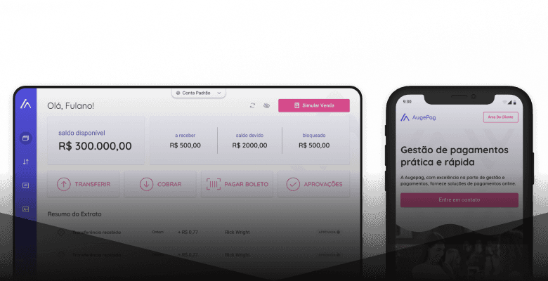
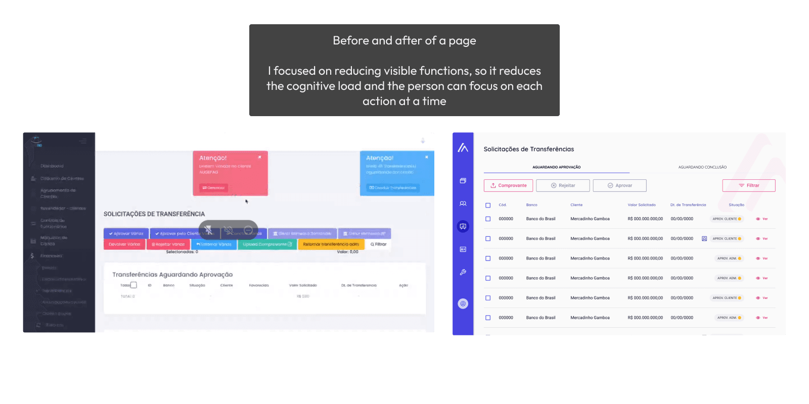
The priority was to build an interface that allows users to understand the actions they are taking easily. The previous interface had too many options, causing cognivite load.

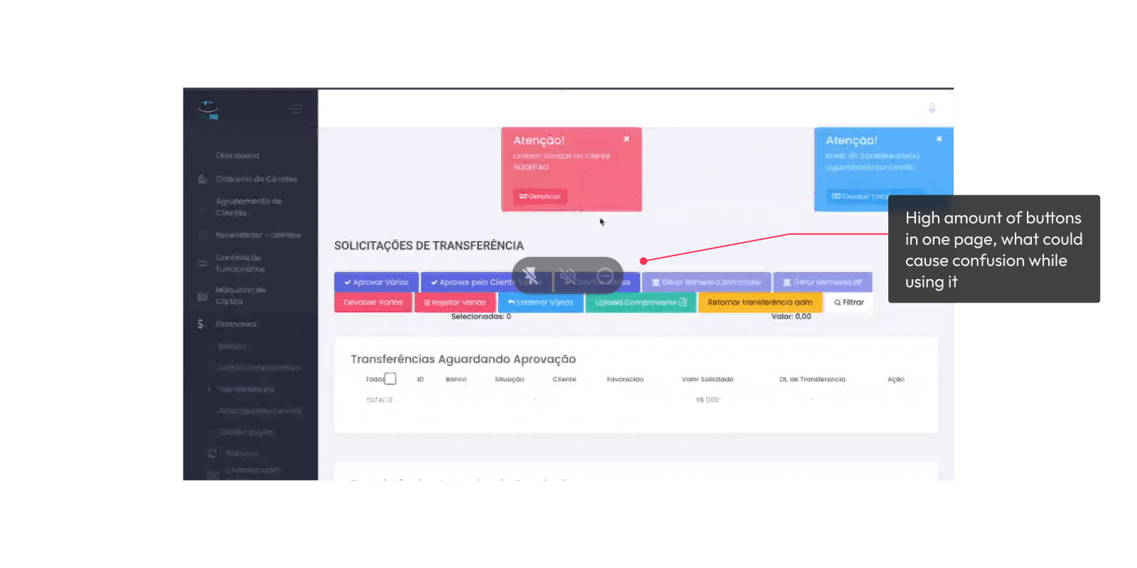
Working with the principle of progressive revelation allows a better experience, optimizing its use. That is, less appearant buttons, more precision on the actions.

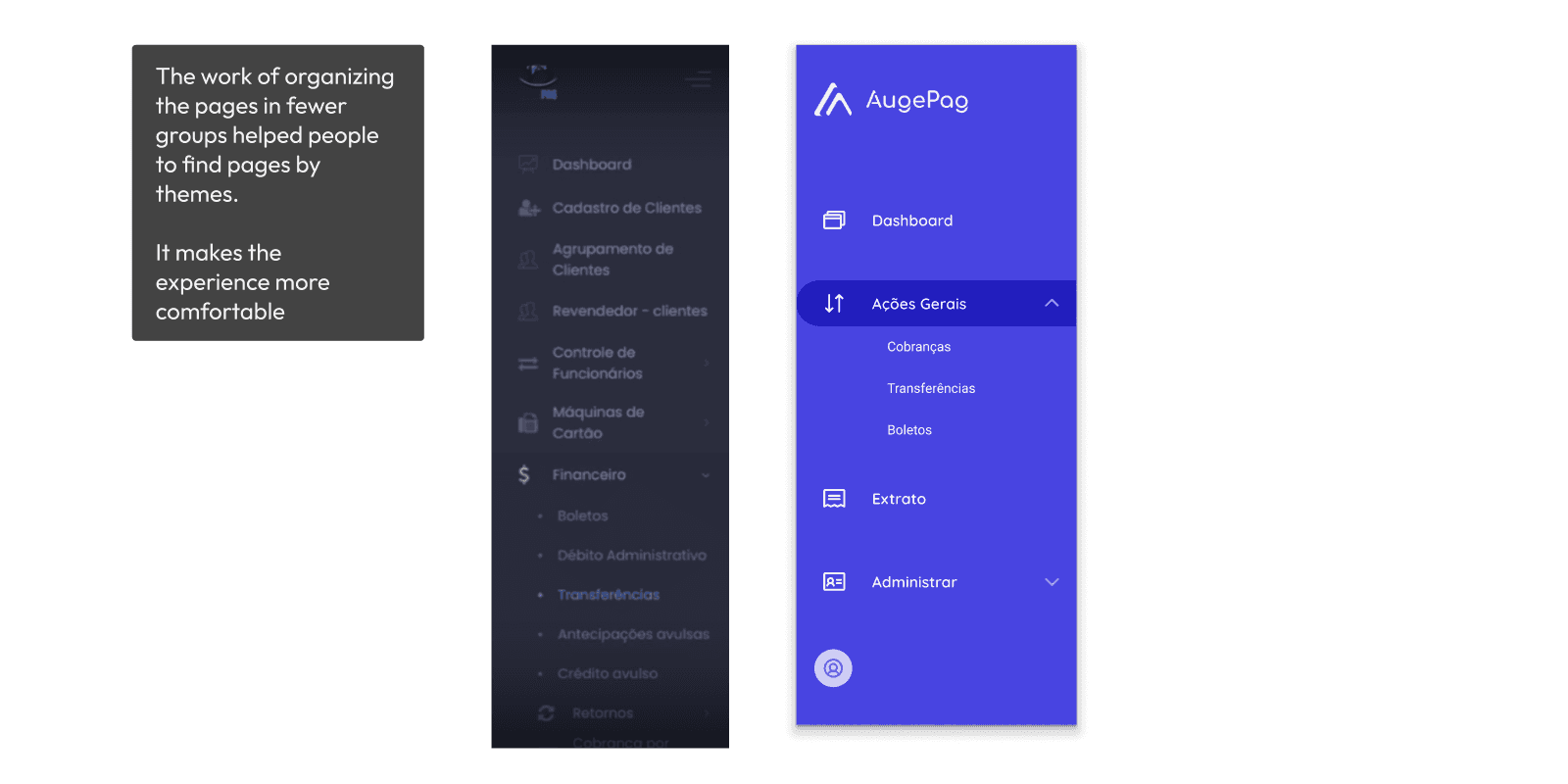
There is consistency and standardization across the entire website, optimizing its performance and improving its usability

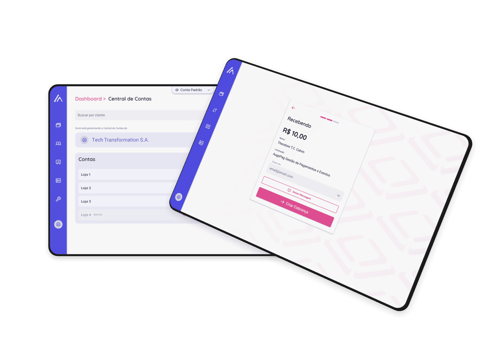
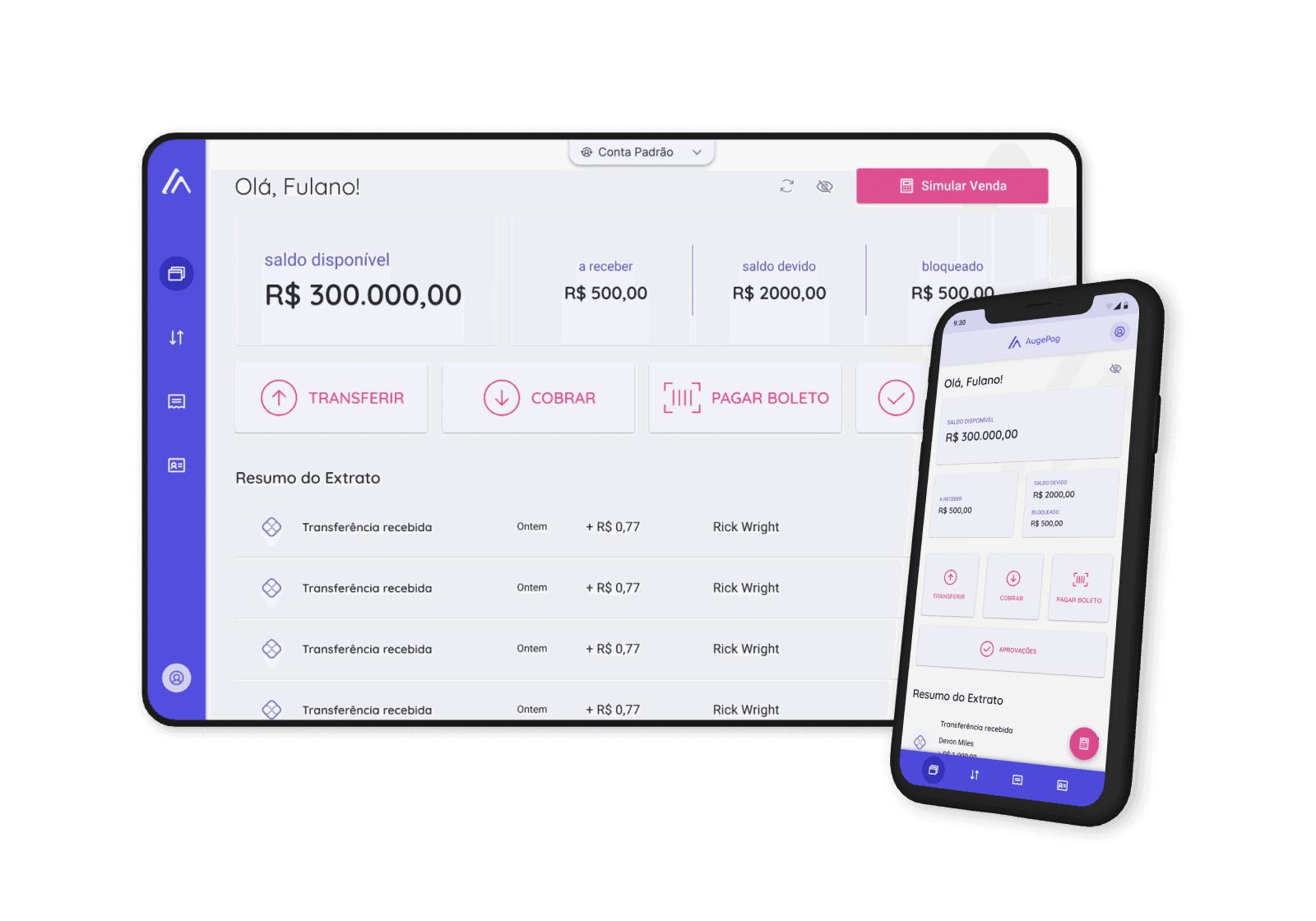
The system is now responsive, having the proper display for diverse sizes of screen.


Conclusion

At the end of the project, we could notice a reduction in the general information displayed, focusing on the main actions for each screen and applying the principle of UX called progressive revelation, which implies revealing actions gradually, decreasing cognitive load - but keeping all of the functions needed by the client.

Centering the information properly allowed for a more intuitive interface, increasing its findability and the ability to find the functionalities of an interface. Plus, we worked on the system pattern, creating a design system, avoiding the excess of different buttons, making the website easier to use and quicker to load.